BRANDING DESIGN

CLIENT: Pierre Baldelli

AGENCY: Scatoleti

INTERIOR DESIGN: Vudafieri Saverino

PHOTOGRAPHY: Santi Caleca

CHALLENGE:.

I was approached by Pierre to create a brand and a corresponding brand image for his new high-end bistro located in Monte Carlo, Monaco.

The overall design direction is inspired by the Belle Époque style (Art Deco), fitting for its location within the luxurious Metropole Hotel and its amenities.

Pierre’s cuisine will be sophisticated yet accessible; it will primarily be French but will also incorporate influences from other culinary traditions.

These rich heritage elements will be reflected in the design.

BRANDING DESIGN

CLIENT: Guido’s

AGENCY: Scatoleti

FOOD PHOTOGRAPHY: Scatoleti

LIFE-STYLKE PHOTOGRAPHY: Alina Nikitina LONDON PHOTOGRAPHY

CHALLENGE:.

Guido’s is an authentic takeaway pasta shop located in London.

The founder and owner, Guido, was and still is successfully expanding his business and had reached out to me for a brand refresh. In need of graphic material for his menus, packaging, shop interiors, social media and much more.

He wanted the new brand image to reflect his witty sense of humor while also enticing his customers’ taste buds. Guido’s pasta is mouthwatering and incredibly authentic, using exclusively Italian ingredients.

"Fantastic looking packs, really love them! really delivering, fresh, delicious and stand out feeling. i must once again say, great job, and when i showed the team today all they could say is wow and great!"

Jeanette (Unilever Finland)

PACKAGING DESIGN

CLIENT: Unilever Crème Bonjour

AGENCY: 1HQ London

CHALLENGE:

Crème Bonjour is a Swedish-Finnish dairy brand that was launched in 1984, initially focusing on cream cheese. Over the years, its product range has expanded to include fresh creams, flavored cooking creams, and blends of butter and flavorings. Until 2013, the brand faced little competition, and its design remained unchanged. However, the competitive landscape began to grow, necessitating a need for differentiation.

The brand’s positioning also evolved; it was no longer perceived solely as a Finnish or Swedish brand but rather embraced a Mediterranean identity. The new spokeswoman, Tessa Kiros, is a chef with Finnish, French, and Greek roots, adding to this Mediterranean flair.

Crème Bonjour is the go-to choice for those seeking to enhance flavor and quality in their cooking. It inspires consumers to add variety and creativity to their daily meals. The brand’s slogan, “Always a little bit better,” highlights its commitment to quality, great taste, trustworthiness, and versatility.

BRANDING DESIGN

CLIENT: Bucci HOLIDAYWEAR

AGENCY: Scatoleti

CHALLENGE:.

Natalia Bucci, an Italian based in London, is the founder of Bucci HOLIDAYWEAR.

What Natalia says about her brand:

“The idea of opening this boutique came whilst I was in Mykonos, waiting for a late ferry, on the last day of my holiday. The thought of going back to grey sky and everyday busy life was dreadful. I thought how nice would it be if I could take some of this back with me.

I have always paid attention to wearing the right outfit for every occasion, but I did not grow up worrying about what to wear on holiday. In fact we used to wear whatever we found first in our wardrobe! But over the years I started to realise that preparing and wearing your holiday wardrobe is part of the fun of going on holiday. In the heart of winter I did not know where to buy summer clothes in London, and so I always felt out of place on holiday as I had nothing ‘relaxed’ to wear.

So I decided to open this boutique where my friends (and hopefully you) can shop before leaving for the next destination, whether it be a city break to Andalusia, a Greek island hopping tour, a finca stay in Ibiza, a yacht trip in the Caribbean, or wherever else your fantasy takes you. And hopefully you can also wear what you find on here on sunny days in town, anywhere you live!”

My scope was to design a successful logo and brand image reflecting her brand ethos.

BRANDING, PHOTOGRAPHY AND COMMUNICATION - MAKING OF A FOOD BUSINESS

CLIENT: Letizia Fraschini (myself)

AGENCY: Scatoleti

FOOD PHOTOGRAPHY: Scatoleti

LIFE-STYLE PHOTOGRAPHY: Sebastiano Buonamico

CHALLENGE:

LA MIA PIZZA was a project I started during the lockdown, and I managed everything myself.

The project involved creating homemade sourdough pizza kits that customers could order online and have delivered to their homes. Since it was my own venture, I handled all aspects, including the graphics, menu photography, Instagram page, website, newsletter, and everything else related.

Unfortunately, I had to wind it down due to my second pregnancy. It was a fun and challenging experience, but ultimately very fulfilling!

BRANDING AND PACKAGING

CLIENT: Tigre y Oliva

AGENCY: Scatoleti

LIFE-STYLKE PHOTOGRAPHY: MASTROSIMO PHOTOGRAPHY

CHALLENGE:

TIGRE Y OLIVA is a single-origin craft chocolate brand from the Philippines, founded by Italian chocolatier Simone Mastrota. In his quest for the world’s best cacao, he became intrigued by Asia as a new frontier for cacao production. He discovered that the Philippines possesses the oldest history of cacao in Asia, thanks to the Spanish galleon trade routes.

Simone eventually met Rob, a social entrepreneur and cacao expert. Rob found a tropical paradise and made the Philippines his new home, settling in a surfing community in the northern part of the country, where he began creating his own line of chocolate. The company, Tigre y Oliva, is named after Simone's two daughters, Tiger Lily and Olive.

I have been tasked with designing a logo that embodies the spirit of Simone's family, which has always been "on the move" and embraces a "hippie" ethos.

Crafting is a key aspect of the brand's identity.

LOGO REDESIGN, BRANDING AND WEBSITE DESIGN

CLIENT: Mantegazza Formaggi spa

AGENCY: Scatoleti

FOOD PHOTOGRAPHY: Sebastiano Buonamico

CHALLENGE:

Mantegazza Formaggi is a three-generation family business specialising in the import and export of cheese and other products, including cured meats, fish, and sauces. The factory is now under the leadership of Niccolò Mantegazza, who sought my help to modernise the image of his cherished brand. A comprehensive effort included updating the logotype, enhancing the iconography, redesigning the catalogues, and finally developing the website.

BRANDING DESIGN

CLIENT: BOTANIC

AGENCY: Scatoleti

CHALLENGE:.

BOTANIC is a specialized bijoux shop that features a carefully curated selection of designer jewellery from around the world. This small yet precious independent store is located in the heart of Varese, in northern Italy.

The logo of BOTANIC incorporates a natural element—the maple seed.

The maple seed is symmetrical, symbolizing the two business owners. It is light and intricately detailed, just like the exquisite pieces of jewelry available in the shop.

PACKAGING DESIGN AND PHOTO SHOOT DIRECTION

CLIENT: Carte d’Or Food solutions

AGENCY: 1HQ

FOOD PHOTOGRAPHY: Terry Benson photography

CHALLENGE:.

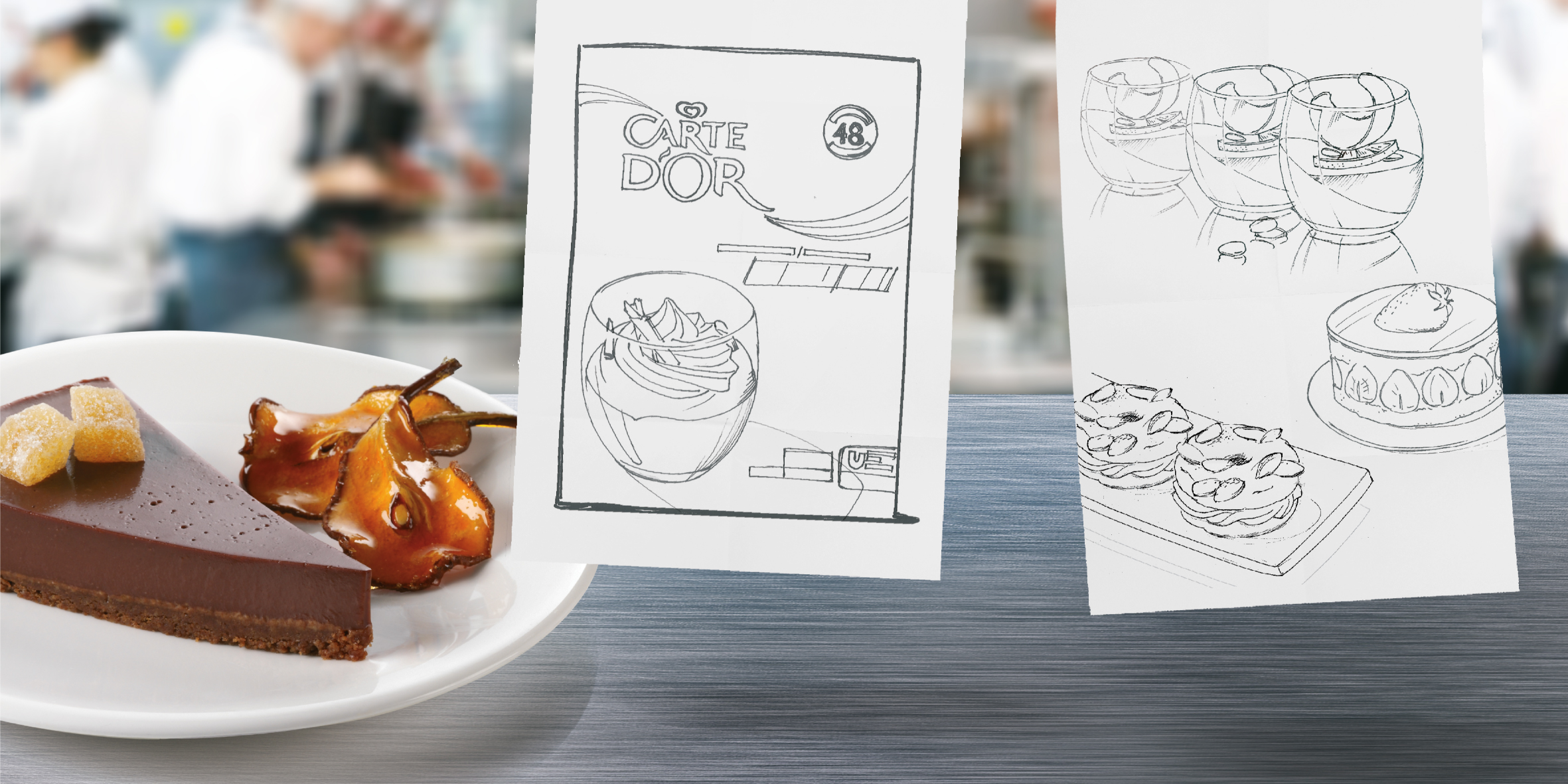
CARTE D’OR offers a wide range of products specifically designed for the food service industry.

1HQ was approached to enhance the visuals of these products through premium photography and a more approachable front-of-pack design.

I had the opportunity to hand sketch the desserts and direct the photoshoots, making this an incredibly rewarding project!

BRANDING DESIGN

CLIENT: Paripé group

AGENCY: Scatoleti

CHALLENGE:.

The Paripé Group is a dynamic and creative organization that is constantly evolving. They are dedicated to exploring new methods for providing entertainment and leisure experiences for all their clients.

Currently, the group operates 12 venues, each with a distinct style, where they offer a wide variety of experiences. These include event celebrations, catering services, concerts across all musical genres, and a selection of excellent cocktails, coffees, and specialty drinks.

The phrase “Hacer el paripé” is a Spanish expression that translates to “to put on an act.” It humorously refers to behaving in a way that is contrary to one’s true feelings.

I have thoroughly enjoyed designing the playful logo, which can be disassembled and rearranged to create different shapes that enhance communication.

BRANDING DESIGN

CLIENT: Flair Hair colour

AGENCY: Scatoleti

CHALLENGE:.

FLAIR is a premium salon-at-home organic hair care brand that offers a variety of high-quality hair dye products. Their organic box dye delivers vibrant, long-lasting colours while nourishing and strengthening the hair with natural ingredients. The brand's mission is to provide the luxury of salon-quality results in the comfort of your own home.

The challenge for their branding and packaging design was to create a look that was disruptive yet professional, accessible yet elevated, functional yet aspirational, and easy to use and understand while remaining distinctive.

BRANDING DESIGN

CLIENT: Azienda agricola Ginestreto

AGENCY: Scatoleti

CHALLENGE:.

GINESTRETO is the name of both the estate and the location where this Extra Virgin olive oil is produced, situated in the surroundings of Rome. The owner, Giorgio, is a sweet man in his nineties who remains passionate about his estate. Although he is nearly blind now, he can vividly envision his magnificent olive trees in both his heart and mind.

The result is a delightful, strong, and pure olive oil that is 100% extra virgin, showcasing the human touch and artisanal quality behind its production. The logo features Giorgio's beautiful and spontaneous handwriting, simply encased in an olive.

There is no need for frills, just excellent olive oil.